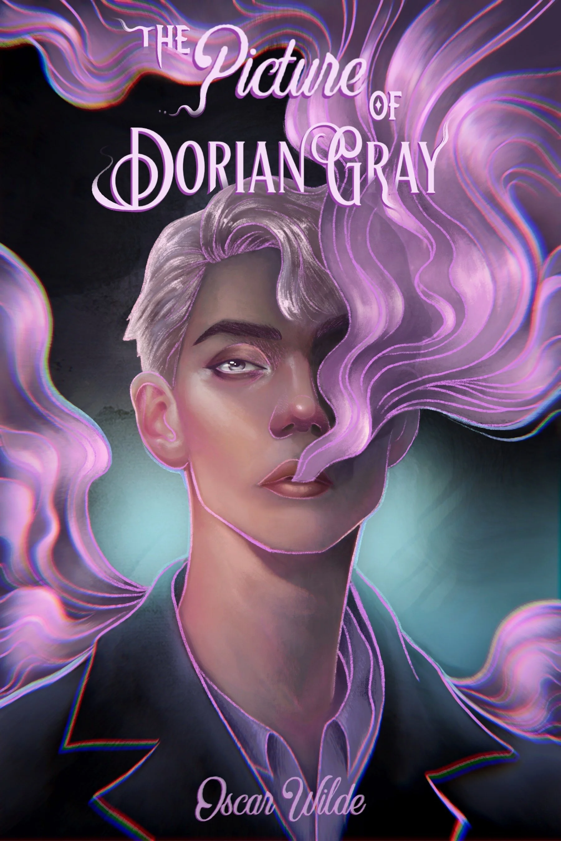

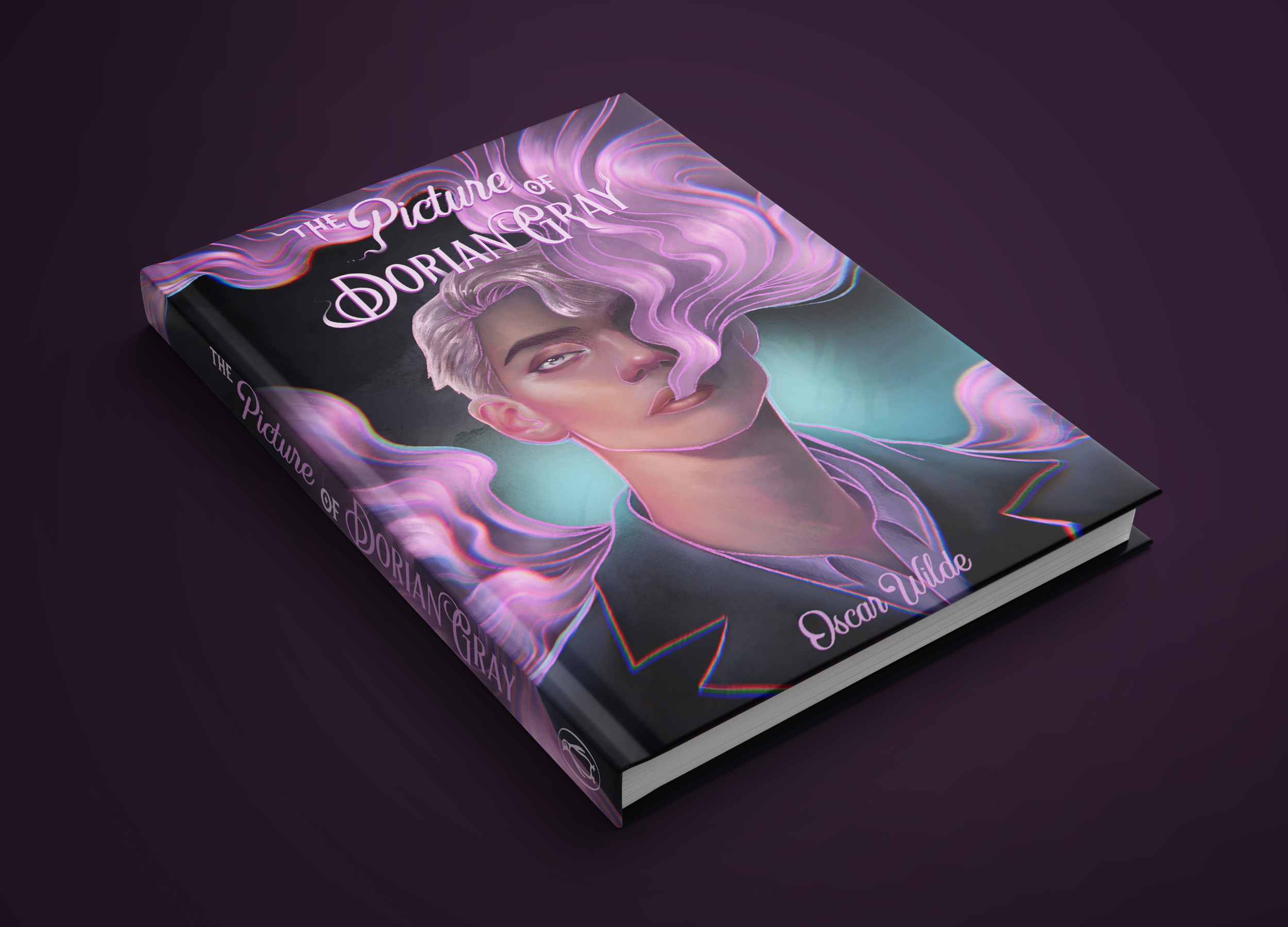
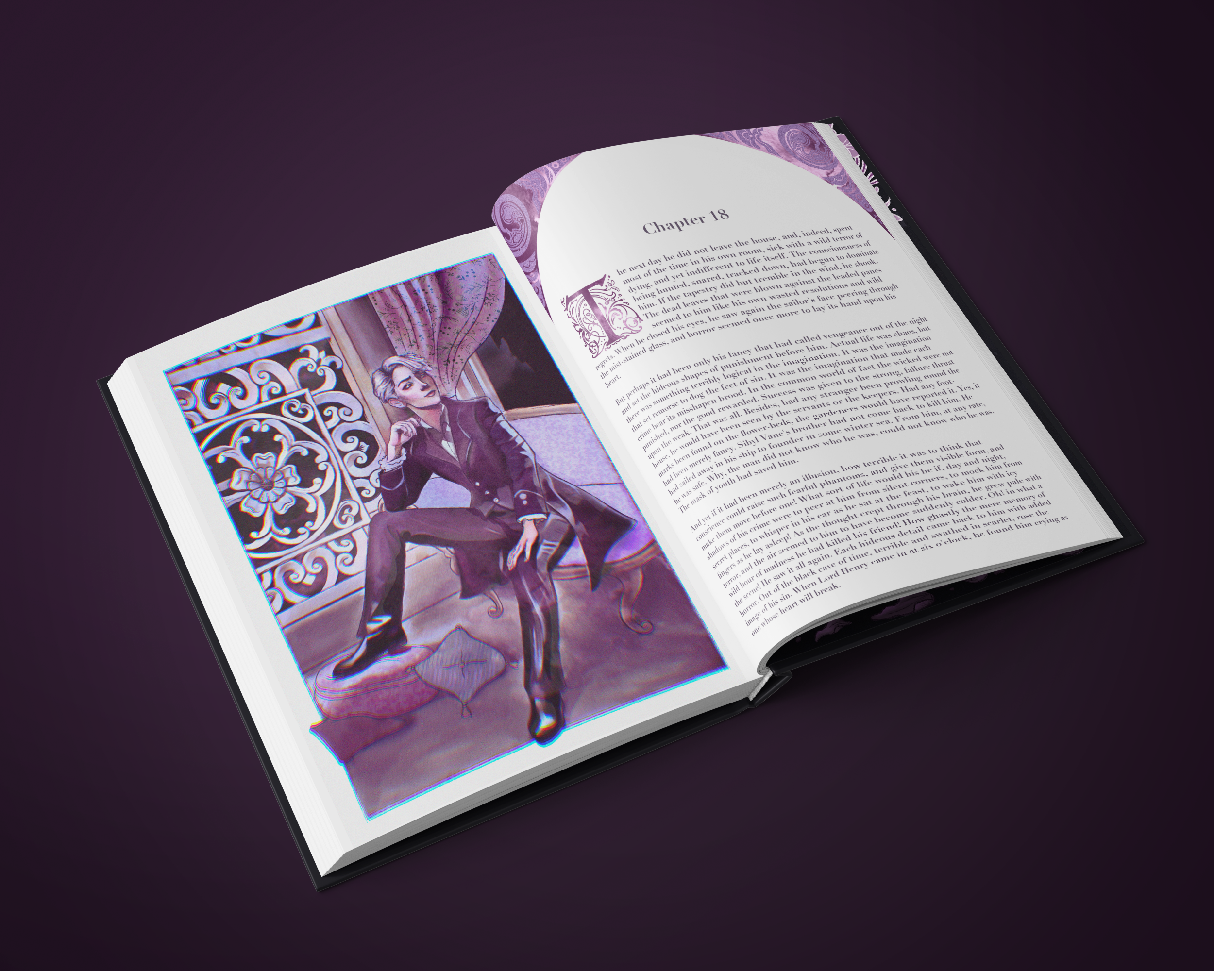
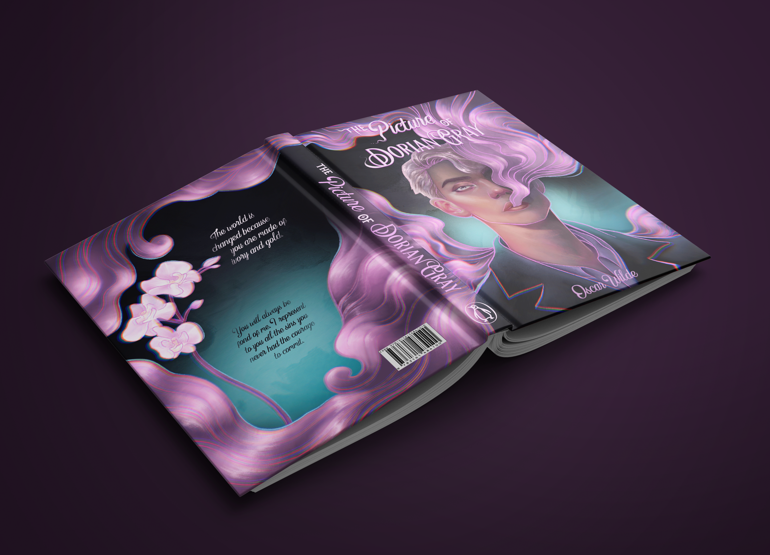
For this project, I redesigned the cover for The Picture of Dorian Gray. Despite it being a classic, I wanted to give it a fresher look to attract a new audience. To do this I included dispersion and bright colors to the line art. The smoke covering half of Dorian’s face is pink, giving it a whimsical feel, while the greenish hue behind him gives it some mystery. The smoke depicts Dorian’s beauty fading away and that the inside isn’t as pretty. It also illustrates that he is hiding something, feeding into the mystery. The offset lines towards the edges of the illustration depict illusion and duality.
For the type, I went with a decorative type as it goes with the time the story is set on, bringing the classic and new feel together. It also accentuates how beauty is the central theme of the book.
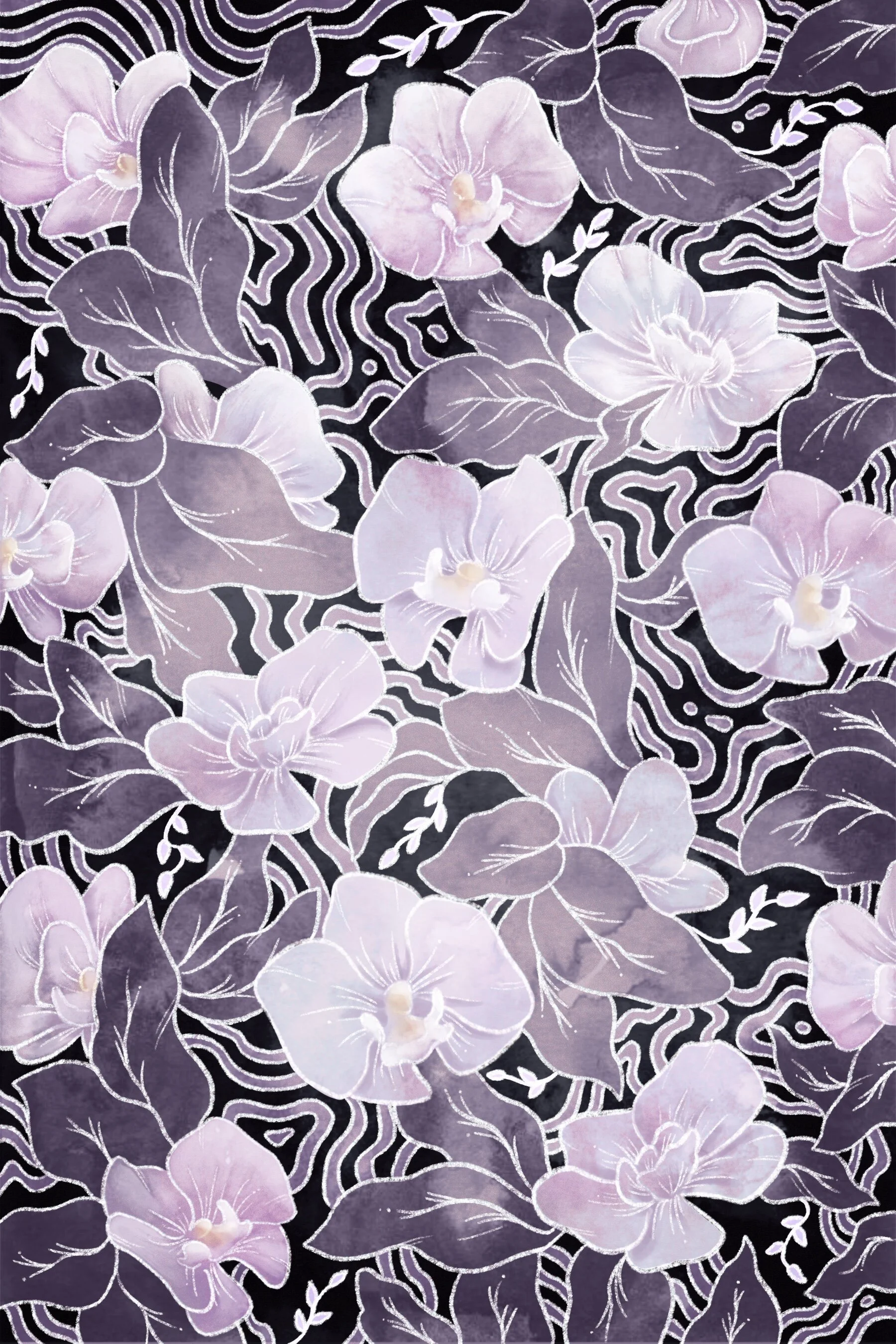
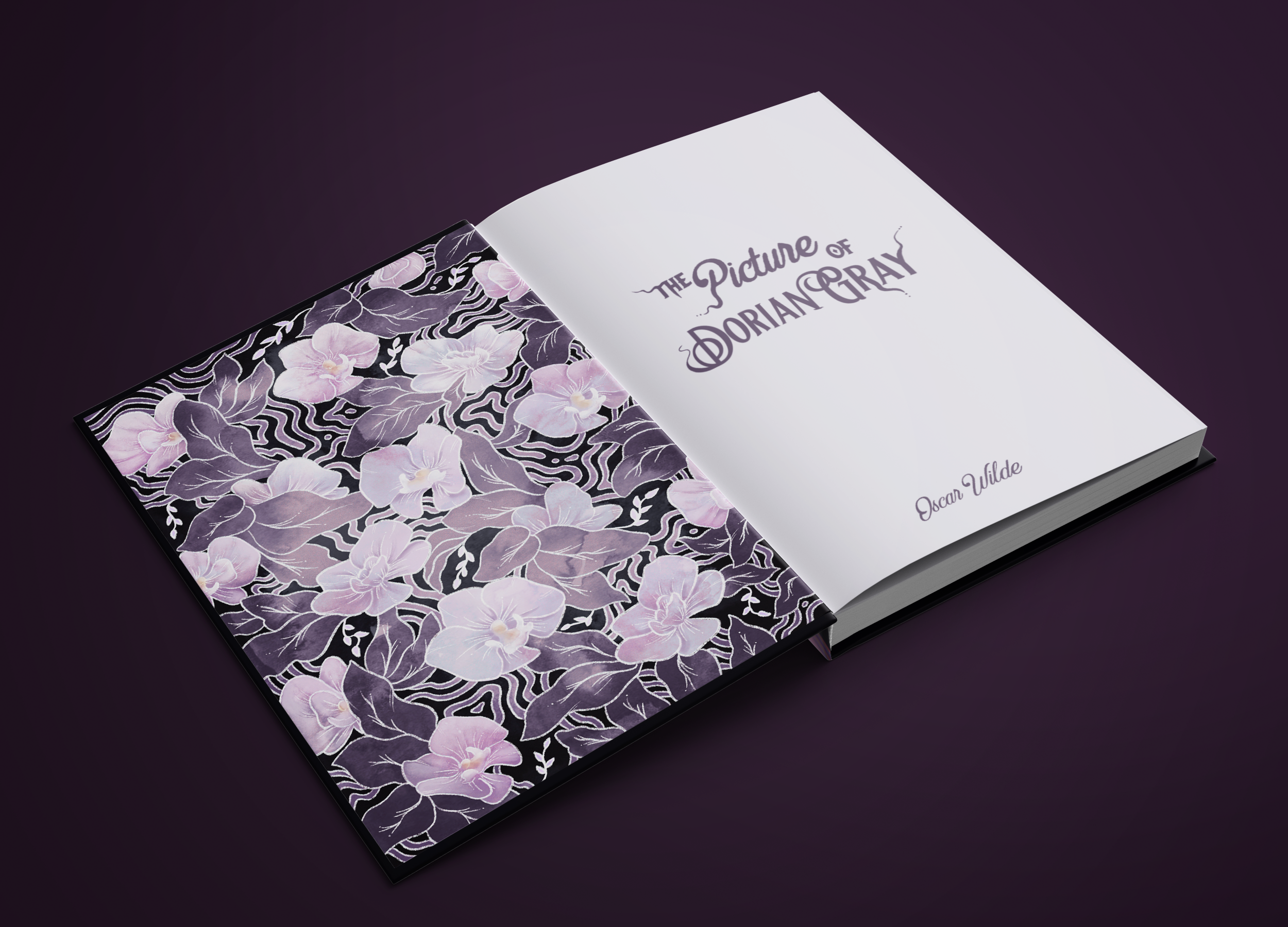
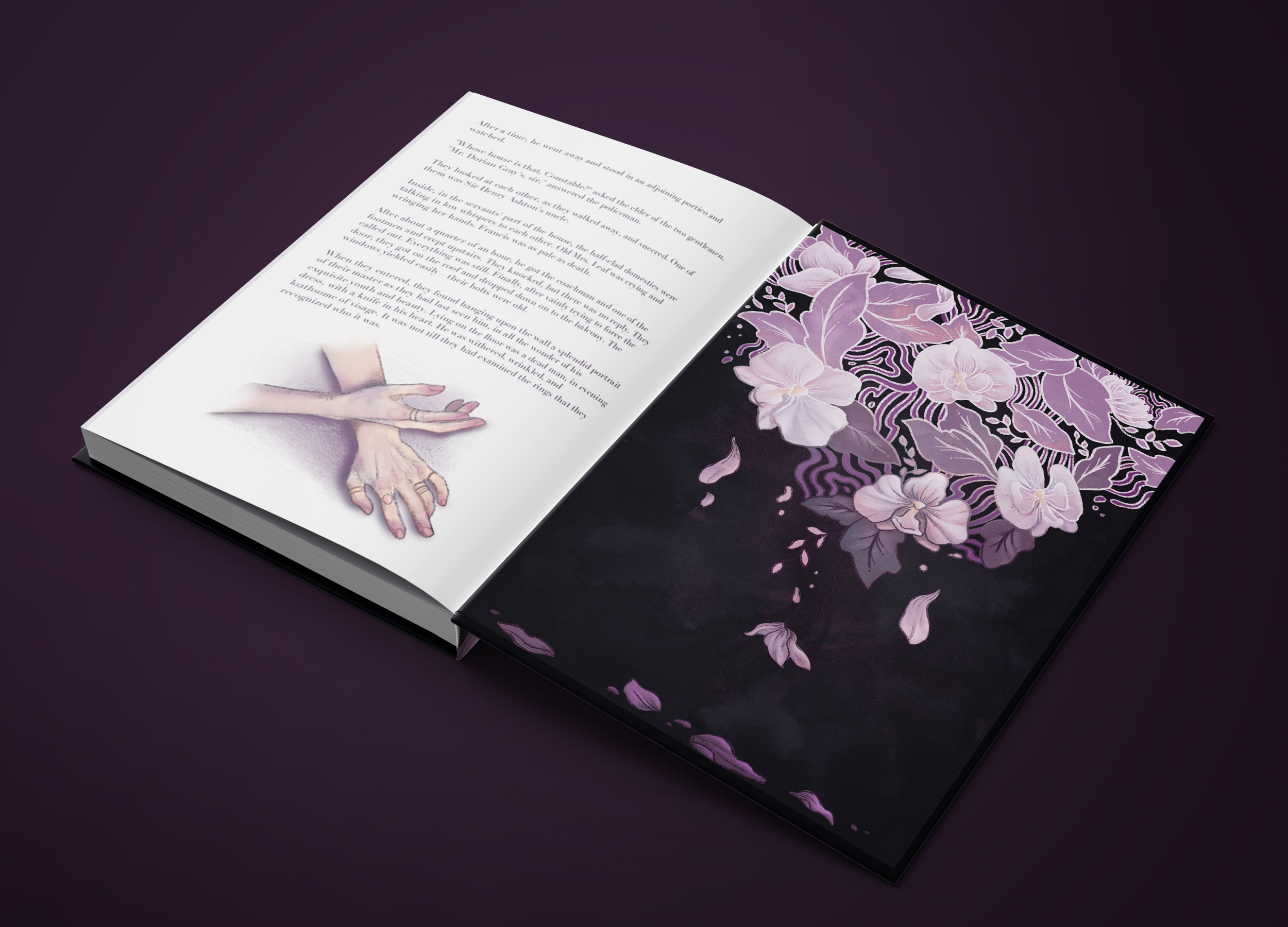
For the patterns I decided to go with orchids since they are a symbol in the book. The beginning pattern is healthy while the ending pattern is falling apart. This demonstrates Dorian’s death and the ephemeral beauty.
